Quote of the Month

When love and skill work together, expect a miracle. John Ruskin


Showing posts with label alphabet. Show all posts

Monday, January 14, 2019

The Marking Of Twenty-Six

One of the most enjoyed units in our library each year was exploring the Japanese form of poetry called haiku.  For students hesitate to write poems, our choice to use a line of five syllables followed by a seven-syllable line and concluding with a five-syllable line was a structure many of them appreciated.  Did all of them adhere to the perimeters?  Not always, but the results, whether they selected the pattern or not, were wonderful.  You could feel the joy in the room as they discovered simple and ordinary things in our world are worthy of transformation and validation.

In 1968 the Haiku Society of America was founded.  One of its charter members was New York City public school teacher and writer Sydell (Syd) Rosenberg.  This woman, who passed away suddenly in 1996, had a dream.  Her children, specifically her daughter Amy Losak, vowed to make her vision a reality.  H Is For Haiku: A Treasury of Haiku from A to Z (Penny Candy Books, April 10, 2018) written by Sydell Rosenberg with illustrations by Sawsan Chalabi is a collection of twenty-six poems written for children (but to be enjoyed by all ages). In an introduction Amy Losak writes a letter to readers before her mother poetically defines haiku.

These twenty-six haiku poems take a different approach to exploring our alphabet.  Instead of solely focusing on a person, place or thing represented by a letter, each poem begins with the appropriate letter. It's a different path to take, allowing for more possibilities.

Adventures over
the cat sits
     in the fur ring
of his tail, and dreams 

Everyday sights in her city capture Rosenberg's attention.  A boy seated on a mailbox, a berry-carrying blue jay and the act of getting a first library card are a few of the first to be noted.  Items seen on the back seat of a car are prime elements in her imaginative mind.

On a rainy day, a cluster of children holding umbrellas become fungi.  A large seed carelessly tossed is a toy for a fun-loving feline.  A broom is formed by a tail twitching in the rays of sunshine.

The simple act of riding a bike on an autumn day reads like a short symphony.  You will wonder which is louder; a thunderstorm or the cacophony of recorders.  A perception on a full-moon night tricks a looker's eyes.

Laundry hanging on a clothesline reveals memories.  Puddles take pride in their purpose.  Each letter takes readers on a journey of discovery.  During this trip we are invited to breathe deeply, stop, focus and use every one of our senses. 


With her writing of haiku in this book, Sydell Rosenberg guides children into the world of not only poetry but in the art of observation.  As she talks in her definition, haiku is a captured heartbeat.

Before the hoof comes down---that's haiku.

Sydell Rosenberg takes what might be an insignificant instance and with intention delivers something connecting us to each other.  Here is another of her poems from this book.

Neon wings
     of moth
exploding into headlight,
on a country road


At her website artist Sawsan Chalabi states most of her work is digital but she also uses

traditional line work and textures.

On the front of the dust jacket she gives us the impression of the H as being a part of the landscape with the clouds on the front extending over the spine to the left and back of the jacket.  This is precisely what author Sydell Rosenberg wants readers to see in her poems and in their day to day lives.  The featured girls are relaxed, comfortable.  I particularly like them being barefoot.

A colorful, tiny "v" patterns the opening endpapers (I'm working with a digital copy.)  On the title page a turtle mentioned in one of the poems is basking on a rock.  He is one of the first examples of a keen sense of humor Sawsan Chalabi displays in this book.  His nose is rather long. (He reminds me of Jimmy Durante.)

The full-color illustrations shift from full-page pictures to double-page images.  Some of the visuals only contain two colors, limited colors or an array of hues.  The fonts are bold, like many of the lines.  Readers will be delighted and surprised at the change of perspective; landscape view to close-up, depending on the poem.  Sometimes the illustrations are distinctively alone but other times one joins another; separate but parts of a larger whole.

One of my favorite pictures is of the children walking in the rain.  All four children from the bottom of the page to near the top are carrying red umbrellas with large white polka-dots.  The colors in their clothing, yellow, teal and orange, and the umbrellas are reflected in the colors of the letters in the poem.  The green from the iguana on the previous page is the color of the first letter, "H".


Sure to inspire and challenge readers to pen their own poems, H Is For Haiku written by Sydell Rosenberg with illustrations by Sawsan Chalabi is like a welcome sign.  Readers will start to look around a room in which they are sitting or standing, they will watch people whether they are in a grocery store or a movie theater and they will seek out animals domesticated and wild.  All have the potential to become part of a haiku poem.  Poetry collections will benefit from having this title.

To learn more about illustrator Sawsan Chalabi please follow the link attached to her name to access her website.  At the publisher's website you can view interior illustrationsAmy Losak and Sawsan Chalabi are interviewed at author and illustrator, Jen Benton's website.  Amy is interviewed at Matt Forrest Esenwine's site, Vivian Kirkfield's site, at Cynthia Leitich Smith's site, at KidLit411 and Celebrate Picture Books.  Amy Losak wrote a guest post at Laura Sassi Tales.  At Teachers & Writers Magazine, a lesson around Sydell Rosenberg and this title is showcased.  Amy maintains an account on Twitter


Wednesday, February 24, 2016

In Their Mind's Eye

We dream.  We dream during sleep.  We dream when we're awake.  Our dreams allow us to explore possibilities.  We humans are not alone in the act of dreaming.

Scientific evidence through testing confirms dogs dream in a similar fashion to us.  They happen to dream of their dog days and activities.  Author illustrator Kim Krans wonders artistically, without words, in her newest title, ABC Dream (Random House, January 19, 2016) on what images might be found in our twenty-six letters' thoughts as they drift into deep sleep.

Some of the elements finding their way into the minds of the letters are recognized as having been represented in other alphabet volumes but their presentation here is highly original and exceptionally imaginative.  An apple is poised on the top of an A patterned in argyle.  It has been pierced by two arrows.  An apple core is at its base being eaten by ants.  These insects are crawling along the single letter and the arrows.

There is movement in many of the letters' dreams.  A braid swings.  A chicken pecks at cupcake crumbs. Dandelion seeds drift.

As in our own restful inspirations we readers look and suspend belief as flights of fancy form.  An egg balances in the starry universe.  Fish float by fireflies. A happy hedgehog is wearing a party hat patterned in hearts.

Jellyfish journey.  Lambs lay on lace.  A nest is nestled in a nook.  A panda ponders amid puzzle pieces.  A queen's crown adorns a bird's crest.  A rope curtains off a change in the weather.  We are challenged by the ideas the letters give, asking us to think beyond the concrete.

The letter U takes the front image twisting it in speculation.  Zinnias scatter across the plain occupied by the African horse with the distinctive stripes and upright mane.  Though the last letter has revealed its musings we begin again wanting to join in the ABC Dreams once more.


Other than the twenty-six individual letters featured in each single or double-page illustrations, there is no text.  With that being said, these pictures speak volumes.  They are alive with questions and answers.  How did those two arrows get so close to one another in the apple?  Who ate the apple?  Did they leave it knowing it would be a feast for the local ant community?  Kim Krans is asking us in silence to participate.


When you open the matching dust jacket and book case the resplendent unicorn's neck and upper portion of its body continues across the spine to the ISBN framed by leaves.  Leaves are placed in the upper left hand corner, over the spine, and off the front lower-right edge.  Elements from the interior pages are placed throughout this illustration; fireflies, a fish, a dragonfly, a celebratory hedgehog and the dandelion seeds. There is spot burnished gold along the unicorn's horn on the jacket.

The endpapers are filled with rows of repeating alphabet letters in outline.  Spots of color outline some of them.  Kim Krans continues to place small items from other images on the verso and title pages.  The heavier, matte-finished paper is an excellent choice for her pictures rendered in pen and ink and watercolor washes.

With the exception of letters E, N, O, and W the canvas for the illustrations is white.  Most of the visuals extend over two pages.  Any highlighted animals are participating in the dreams; the dog looks upward at the dragonfly, a fox watches the fish and fireflies, a kitten plays with the tendrils of the jellyfish and wasps feast on forgotten fruit.

Thicker lines border the letters but the intricate details in other elements welcome readers to stop and look at each image trying to guess what each dream discloses.  Krans uses color sparingly for emphasis.  Design items will have readers gasping in delight as in the manner in which the H and I pages are joined.

One of my favorite letter dreams is for the T.  At first glance you see tigers next to a tree trunk taking up a large portion of the left side of a single page.  Not only does this represent tiger, tree, and trunk but two and tired.


Not only is ABC Dream conceived and illustrated by Kim Krans an object of beauty but it will promote endless conversations about design, layout, the use of color and the elements in each image.  Each letter's dream has a story to tell.  This is a must have for collectors of alphabet books.  It is a wonderful addition to personal and professional bookshelves.

To learn more about Kim Krans and her other work visit her personal website and The Wild Unknown by following the links attached to her name.  For a few interior illustrations please visit the publisher's website.  Kim Krans is interviewed about this title at The Children's Book Review.  Enjoy the video peek at the book below.  Stand-on-a-desk-shouting-I-love-reading educator Colby Sharp interviews Kim Krans at sharpread.  You will love these questions and Krans' answers.


ABC Dream from the wild unknown on Vimeo.

Thursday, July 23, 2015

The Triumphant Twenty-Six

You can see it on their faces; the joy felt in the mastery of the alphabet song.  When you say the first letter attached to the well-known first note, children begin singing immediately.  Once learned it's a tune available in our memory banks for instant recall.

These twenty-six symbols represent more than we can imagine.  They are the keys to locks on doors not yet made. Author illustrator Tad Hills (How Rocket Learned to Read, Schwartz & Wade, July 27, 2010 and Rocket Writes a Story, Schwartz & Wade, July 24, 2012) has recently released another delightful treat in R is for Rocket: an ABC book (Schwartz & Wade, July 7, 2015).  Rocket, his pals and a character from other Tad Hills' books don't want to miss telling readers about the astonishing alphabet.

Rocket and his friends have fun learning the alphabet.

Rocket finds acorns.

Owl draws an angry alligator.

Readers will see Bella with a familiar ball.  Owl knows how crows crave collectibles.  Emma enthusiastically digs and discovers an egg-cellent object.  Why is Fred in the field at night?

Gathered in conversation, the group fails to notice someone in the grass.  What does attire for heads and green items have in common?  You'll have to ask Bella and Rocket.  Owl is jazzed about kindly winds.

Rocket enjoys reading a lovely note as an insect leans near to hear.  Fred meets a friend.  Owl needs seaside encouragement and Bella gears up for the occasion.  It only makes sense to have Rocket and Owl partnering to be productive.

Shhh... our nighttime frequent flier is not quitting but recovering in the silence of the day.  Two terrapins travel toward a talented bird.  Someone needs the ultimate weather protection.

As the end nears the duo, Rocket and Bella, take action and ask a question.  Notes from a musical instrument ring out in the woods as Yellow Bird offers an opinion.  Readers agree, from a to z, these animals are as busy as the proverbial bee; you'll see.


Using one, two or three statements, a question or a conversational observation Tad Hills introduces the letters of the alphabet and reinforces their use.  His use of alliteration makes the sentences fun to read aloud.  I enjoy new words for younger readers like frolics, prefers, zest or zeal.  In conjunction with the other words, their meaning will be easy to decipher.  Here are two more sentences.

Rocket finds a hat on a hill and puts it on his head.
It makes him happy. 


When readers look at the matching dust jacket and book case, they will find comfort in the return of beloved characters.  A willingness to work together is unmistakable in their presentation of the title.  On the back, to the left, Rocket sits alone on a hill with a hat on his head. When unfolding the jacket, readers are in for a surprise, a Rocket-style surprise.  The color used for the Rocket text on the jacket and case is the background hue for the opening and closing endpapers.  On the title page, the tiny but tremendous teacher, chalk in hand, gazes at a chalkboard filled with upper and lower case letters of the alphabet placed on an easel in the meadow.

In all kinds of weather, day or night, the setting is the familiar woods and fields frequented by Rocket and his companions.  Rendered in oil paint, acrylic, and colored pencil Tad Hills continues to create characters you wish you could meet in your very own woods and fields.  Their expressive, wide eyes convey a range of feelings.  A tilt of head, outstretched arms or a hand, and legs lifted or running invite us to join them.  Most of the images cover two pages but Hills pauses the pace with smaller oval pictures framed in white.  He does offer another surprise with a page turn.  Tilt the book to see.  When a specific letter is being addressed it will appear in bold.

Xena's favorite illustration is of Emma digging.  Only her head and a little bit of her shoulders are visible above the hole.  Mounds of dirt are placed around her.  Opposite this, a patch of daisies covers the right page.  One of my favorite pictures is of Bella, the squirrel, ready to play in the ocean.  She is wearing a stripped inner tube, red water wings, and a blue snorkel and mask.  It's not something you would expect to see on a squirrel.  Tad Hills does know how to make us smile and endear his characters to his readers.


R is for Rocket written and illustrated by Tad Hills is an adorable addition to the Rocket books.  It walks us through Rocket's world, engaging us in an assortment of activities and events as well as the feelings of his friends.  I'm adding it to my collection.  I know you will want to do the same.


To learn more about Tad Hills and his other work, please follow the link attached to his name taking you to his website.  At the publisher's website they give you a peek at several interior pages.   There are different images on their Flickr pages.  A video with Tad Hills is showcased below.


Update October 7, 2015 Enjoy this video with Rocco Staino interviewing Rocket and Tad Hills on KidLit TV.

Wednesday, January 14, 2015

Imagined To Be Real

Monster
a strange or horrible imaginary creature
something that is extremely or unusually large
a powerful person or thing that cannot be controlled and that causes many problems

By these three definitions alone literature, mythology and legend from cultures around the globe are filled with monsters.  They inhabit dreams and reality depending on your sources of information.  Several have been the object of a lifetime devoted to discovering the truth.

No matter what you believe it is clearly understood by educators and parents, the subject of monsters is a highly popular one.  Empty shelves and late night reading by flashlight supply all the evidence you need.  M is for Monster: A Fantastic Creatures Alphabet (Sleeping Bear Press, August 1, 2014) written by former United States Children's Poet Laureate J. Patrick Lewis with illustrations by Gerald Kelley provides readers with the perfect amount of information to satisfy their curiosity and whet their appetite for more.

A is for Amarok
  The Inuit were afraid of Amarok,
           a wicked wolf that pounced to the attack.
   And some who dared the forest of the night
            unluckily would not be coming back.


For each of the twenty-six letters a four line rhyming poem is embedded in the illustration.  Either to the left or right of the image on a column of color, readers are supplied with informative text about the being's origin, history and prominence in today's world.  Featured creatures range from the well-known to those rarely discussed outside certain circles.  

Perhaps readers learning about the Inuit people would be interested in knowing of the giant wolf named in the first letter.  If a mortar and pestle is seen propelling across the sky, beware of a house on chicken legs with the hungry inhabitant.  Half-men and half-horses, dragons that fly or dragons that crawl or dragons with no front legs at all, naughty or nice elves and an experiment not quite right will have readers wondering and wishing.

Are gargoyles placed to protect or frighten?  Is it logical to think of a griffin and horse as being friendly?  When was the last time a parent called their child an imp and why?  You might be surprised by this answer.  Would you walk alone after dark in the Pine Barrens of southern New Jersey?  Do you know what lurks in the depths of the oceans and would you dare to meet the Kraken?

From the Scottish highlands back in time to ancient civilizations to pools of fresh water and along the edge of forests, discoveries are made, welcomed and feared.  Full of light and renewal, the legend of the Phoenix has stood the test of time.  An immortal feathered serpent, a bird big enough to lift an elephant, a soul-stealing shape-shifting stalker or a troublesome troll are to be revered or avoided at all costs.

You might need a young girl pure of heart, a bushel of garlic, or weapons formed from silver, to attract or defeat these memorable monsters.  A headless being from ancient China, a hairy beast from the Himalayas and the undead close out this categorizing of things seen and unseen.  Regardless of the veracity of their existence all will be firmly part of your memory (and hopefully not your shut-eye time) now.


With some quick and simple reference checking (no back matter is supplied), it is evident J. Patrick Lewis has done his share of reading about these creatures of lore.  Of particular interest is his narrative on the origin of the monster and a logical, if possible, explanation for their presence in our cultures.  Each paragraph in his text reads like a conversation often posing questions to the reader, asking us to think about possibilities.  Here is an example from the first letter.

Was he five feet long and two hundred pounds, as some people claim?  Did he savagely carry off dogs and sheep?  If he was frightening, as the Inuit believed, he was also a good omen.  When the caribou population grew too large, Amarok, so it was thought, arrived to kill the weak and dying animals so that the herd could become healthy again, and the hunt could go on. 


Creepily inviting is an apt description of the matching dust jacket and book case.  You definitely don't want to stick around to find out what that vampire has in store for you but those eyes have you frozen in place.  What can you do but open the book?

Each image painted by artist Gerald Kelley is mesmerizing; alternately haunting, frightening, and at times comical.  Depending on the letter one or two pages may be devoted to his illustration, elevating the words of J. Patrick Lewis.  Emotional responses are triggered with each viewing; the feel of frigid winds howling, swirling the snow as a lone hunter meets the Amarok, a chill of fear as a determined Baba Yaga pursues dinner, a surge of courage as a knight faces the fierce dragon, a sense of calm as a mouse sits upon a gargoyle's head, unspeakable terror as the Kraken moves beneath the shadow of a boat moving on the sea or the head to toe warmth of the breathtaking Phoenix rising from the ashes.

For most of the paintings Kelley brings us close to the action; providing a human or other easily identified elements to give us perspective.  The colors used mirror the scene in which each monster could be found.  Readers are definitely there in the moment with all our senses on high alert.

One of my favorite illustrations is for

S is for Skin-walker

The blend of rust, brown and black, shadow and light, create an overall sense of sinister and supernatural.  The white sightless eyes on the raven, owl, wolf and human are downright spooky.  You don't want to look at those eyes, even for a second.


M is for Monster: A Fantastic Creatures Alphabet written by J. Patrick Lewis with illustrations by Gerald Kelley will be a welcome addition to classroom and library collections.  Don't wait for Halloween, hand this to readers who can't get enough of monsters. This will provide tantalizing extras about the familiar and introductions to those yet unknown.

To learn more about J. Patrick Lewis and Gerald Kelley please follow the links embedded in their names taking you to their websites.  This link takes you to Gerald Kelley's blog where he explains the fascinating process of sketching and painting these illustrations.  Be sure to explore.  There are more posts about his work on this title.  Author and blogger, Julie Danielson talks about this book at Seven Impossible Things Before Breakfast and over at Kirkus. Several pages from the book can be viewed at the publisher's website linked here.

You might also enjoy reading, Monsters & Legends written by Davide Cali with illustrations by Gabriella Giandelli, Fantasy Encyclopedia: A Guide to Fabulous Beasts And Magical Beings---From Elves And Dragons to Vampires And Wizards by Judy Allen, books in the Fantasy And Folklore series published by ABDO Publishing Company and the Monster Chronicles series published by Lerner Publications Company.


Make sure to visit the 2015 Nonfiction Picture Book Challenge page hosted by educator Alyson Beecher at Kid Lit Frenzy to see the other nonfiction or informational books highlighted by other bloggers this week.

I like this tweet illustrator Gerald Kelley sent out about his process.


Wednesday, December 10, 2014

A Handy Handbook

It would be impossible to calculate the number of hours I have spent guiding a circle through a maze as it gobbles up dots, all the time trying to avoid Blinky, Inky, Pinky and Clyde.  Pac-Man was and is still one of my favorite video games.  Several years later I spent a considerable amount of time trying to navigate a lone bicycle rider through the hazards of a suburban neighborhood.  I can still see some pretty strange characters chasing after the Paperboy.  I did also manage to grab every opportunity to assist family, friends and students with tracking down the infamous mastermind in Where in the World is Carmen Sandiego?  After completely vanishing into another world for every waking moment one summer playing Myst, I knew I had the potential to be a serious gamer.

Games, video games, can foster creativity, problem solving skills, desire to increase knowledge about a specific subject, healthy competition, and connections with like-minded people.  Attack! Boss! Cheat Code! A Gamer's Alphabet (POW!, October 14, 2014) written by Chris Barton with illustrations by Joey Spiotto is a guide every gamer will enjoy.  It's a starting point to promote understanding of the basics.

SO...A GAMER, HUH?
HERE ARE A FEW 
THINGS YOU
OUGHT TO KNOW.

While most people are aware of the definition of attack, they will become acquainted with the precision necessary to accomplish this within a game.  For those in the workplace the meaning in gaming associated with boss will definitely bring a smile or two.  Some of the most popular books in our school library are those associated with cheat codes.  You don't have to wait until a holiday to locate Easter eggs hidden by a creative developer.

Point of view, first-person and third-person, is not only for writing but crucial when playing.  Did you know there's a name for the person who gives you problems when you're engaged in a game together?  It's not your special name to protect your identity, handle, but Charlie Brown might understand.  You will be surprised at the interpretation given to certain words like instance or sandbox.

For older video game players the word selected to represent j might incite an outburst of laughter.  Explore a specific genre, master challenges, unleash your inventiveness and learn a new word for a new language as you journey through the alphabet.  Testers, collectors, and seekers can find a spot in this recreational (and professional) realm.

You can lose track of time in a RPG or cheer when you have become unlockable.  For history buffs a term used for designing graphics will increase their appreciation for using the simplest elements to achieve results.  Similar to a term heard in Australia, players can shadow another to learn more about the ins and outs of a game.  Amass XPs, acquire a YOKE and zerg the big guys to enhance your experience.  Learning the lingo letter by letter will have you racing to your next virtual adventure.


Chris Barton has selected twenty-six words either recognizable or unknown depending on your level of expertise as a gamer; defining those using concise conversational sentences.  His explanations use words easily understood by the youngest listener or earliest reader demonstrating his knowledge of the intended audience.  If in a comment he uses a word previously defined it will appear in all capital letters.

To further reader comprehension one of the final pages contains two sentences using all twenty-six terms.  Here is a single definition with a hint of advice.  Barton's narratives ring true of a mentor speaking with avid players.

R IS FOR RPG
Short for Role-Paying Game, and part of a longer acronym (MMORPG, for Massively Multiplayer Online Role-Playing Game).  Filled with QUESTS, characters, strategies, and interactions, these are best played with people you like, because you could be at it for a long, long time.


From the first time you get a glimpse of the book case, it's as if you have entered into a game.  The blue in CHEAT CODE! on the front is carried forward to the opening and closing endpapers.  Using three different shades of the color Joey Spiotto designs four separate screens portraying a game in its various stages.  After an initial title page the formal title page is depicted on the right with our guide, an eager looking guy who begins talking to the reader, on the left.

A diverse, bright and engaging color palette is used throughout reflective of the definitions and the interpretive illustrations.  Many of the pictures extend edge to edge across two pages representing scenes from games.  Others supply pictorial examples of the definitions.  In the case of D IS FOR DEVELOPER Spiotto diagrams the processes to look like the inside of a computer.

Even the single page images flow one after the other, maintaining a reader's interest.  One of my favorite illustrations is for the letter j.  Spiotto features a cave man, wearing glasses, using a hammer and chisel to form the object being described.  The tiny cave paintings of hunters and their prey definitely look like they are straight out of a video game; an early game.


Attack! Boss! Cheat Code! A Gamer's Alphabet written by Chris Barton with illustrations by Joey Spiotto is sure to peak interest, provide for discussion and get readers excited to begin or continue their gaming.  The size, just right for younger readers' hands, and the heavy paper which lies flat after page turns invite repeated inspections.  After reading this I can hardly wait to play the next round of Pac-Man. 

For more information about Chris Barton's books and Joey Spiotto's additional work (this is his first book) please follow the links embedded in their names which will access their websites.  Barton has a list of additional links taking you to informative interviews about his process in writing this book.  Here is a link to the publisher's website showcasing pages from the book.

Without Alyson Beecher's 2014 Nonfiction Picture Book Challenge each week hosted at Kid Lit Frenzy during this year, I would certainly be less informed than I am today.  It's fun each week to feature a title which has taught me more about a variety of subjects.


Tuesday, November 18, 2014

Twenty-Six Tales To Tell

Twenty-six unique symbols with twenty-six individualistic sounds comprise our alphabet.  Twenty-six distinctive characters, either vowels or consonants, when combined make words.  A word or group of words strung together to form a sentence give us the opportunity to express ourselves in writing or through speech with extraordinary results.

If these letters were given the chance to sit down and chat with us we might be treated to twenty-six exceptional yarns spun from centuries of experience.  Or perhaps they might chose to whisper in the ear of the talented Oliver Jeffers.  Once Upon An Alphabet: Short Stories For All The Letters (HarperCollins Children's Books, September 25, 2014 UK)  written and illustrated by Oliver Jeffers is a whimsical, original celebration of exactly what letters can and will do when placed in the hands of a master.

If words make up stories, and letters make up words, then stories are made of letters.
In this menagerie we have stories, made of words, made FOR all the LETTERS.  

These stories for the letters use as many parts of speech as possible starting with the individual featured letter.  To begin we have an astronaut afraid of heights even though he has been training for ages for a particular adventure to acquaint himself with aliens.  There is a bridge burned by two not-buddies, a cup who crashes after leaving a cupboard and a delightful daring girl who dashes away on a donkey.

There might be elephants and an envelope, an unfortunate frog, a glacier guy, a woman who wishes she had used a hammer and a suspicious iceberg.  A thieving dog, dancing royalty, an electrifying woodsman and a mysterious microscope might have something to do with keys, cheese, light bulbs and shrinking.   Discovering what those elephants and envelopes and nuns have in common will drive you nuts...with laughter.

Teamwork finds resolutions, questions lead to more questions (a certain vegetable will never learn and it seems something is lost), and robots have resorted to robbery.  A previous dynamic duo averts a drowning but a tree-eating monster switches his favorite food.  Monkeys, a frustrated musician, a weird but effective giraffe, special glasses, a discarded toy and the return of the astronaut tie all the tales together.


The sentences and phrases used for each letter number as high as eleven and as low as two.  Sometimes Oliver Jeffers uses succinct thoughts, short, to convey exactly what he wants readers to know.  Other times alliterative descriptions boggle your mind at their ingenuity.  More than once he uses a combination of rhyming words to depict his story.  Additions of conversations between characters and narrator asides increase the humor.  Before a story begins one page is devoted to a brief introduction.  As each letter's words are read you can't help but be amazed how Jeffers connects one to another.  Here is a sample letter.

I
The INVENTOR
There once lived an ingenious
inventor who invented many
ingenious things.
His latest invention allowed
him to observe iguanas in their
natural habitat...
...incognito.  

(Two iguanas talking)
Is that an iceberg?
I've no idea


The electric red dust jacket shouts out, "Hey readers!  Look at me!"  Oliver Jeffers includes the astronaut and the Zeppelin, the beginning and the end, on the front.  On the back of the jacket the alphabet is listed in rows in a darker shade of red.  O, R, S, T and Y are in white arranged to flow spelling story.  Embossed in the book case, which is the darker red shade, are eight rows of the letters of the alphabet in the jacket color.  Spread across the white opening endpapers are the capital letters of the alphabet again in the jacket red.  Small elements from the twenty-six stories are cleverly pictured on the closing endpapers.  The title page combines letters from the front and back of the dust jacket.

Each introductory page includes the heading, a large capital letter and a small significant visual.  Jeffers illustrations range from double page to single page to smaller insets.  Every detail is important; the text never says it but Danger Delilah is juggling daggers and naturally there is a fly zipping around from page to page near the frog,   You never know when something from one letter will appear with another regardless of the text; the ladder sticking out of a hole in the background for the letter L comes in mighty handy during the letter U story.  Many details from the O story reappear in this title or have appeared in another book entirely.  Jeffers artwork is playfully marvelous.

One of my favorite illustrations is a smaller one at the close of the L story.  The lumberjack who has been struck by lightning repeatedly is sitting up in his bed reading.  He is holding a glowing light bulb in his hand.  It looks as though there are bears on his pajamas.  The book he is reading is titled Once Upon An Alphabet.  The entire image is done in black and white.


Once Upon An Alphabet:  Short Stories For All The Letters written and illustrated by Oliver Jeffers is a rich and rare alphabet book.  As soon as you close the back cover I'm certain you'll open up the front and read it all over again not once but many more times.  I would plan on having more than one copy available to your readers.

To learn more about Oliver Jeffers please follow the link embedded in his name to his website.  This link takes you to an interview at NPR All Things Considered.  Oliver Jeffers talks about this book and reads several of the stories aloud.

Thursday, December 6, 2012

Letter by Letter From A To Z, Dinosaurs Live From Prehistory

Spotting it on the shelf from the other side of the store, not even seeing the title yet, I knew I had to have it.  A distinctive design and signature style set it apart from the other books in the nonfiction section.  As I picked it up, looking at the front and back of the jacket reading the title, it was hard not to gasp aloud.  I know for sure I was grinning on the outside but jumping up and down on the inside.

In July of 2009 the graphic design team of Sharon Werner and Sarah Forss, owners of Werner Design Werks, located in St. Paul, Minnesota, published their first book, Alphabesties: And Other Amazing Types (Blue Apple Books) bringing them the 2009 Oppenheim Toy Portfolio Gold Medal Best Book Award and the 2009 Parents' Choice Silver Honor Winner.  The equally impressive and entertaining Bugs By The Numbers (Blue Apple Books)(reviewed here) followed in 2011.  Alphasaurs and other prehistoric types (Blue Apple Books), their third and newest title, is an alphabetical look at creatures from prehistoric periods that, in a word, is amazing.


Scary and scaly,
lumbering and lumpy,
fast and ferocious,
big, broad and bumpy.
From up north to down south,
from west to east,
The earth was once home to magnificent beasts.

So begins the rhyming introduction that invites readers to step back in time, entering the world recreated by Werner and Forss.  For each letter of the alphabet a dinosaur name is written on the page with a phonetic pronunciation beneath.  In smaller type on one of the page corners readers will note the time period in which this creature belonged along with whether it ate meat or plants.

Usually along the bottom of a two page spread (ten are single page) alliterative facts focus on outstanding characteristics.  At times more notes will appear as if typewritten in a field notebook drawing attention to further specifics. Careful readers will see even more information displayed in the lines used to replicate a particular setting (leaves), the curve of spine or jaw.

What makes this book notable, as were the previous two, is the technique employed to illustrate the animals, insects and now, dinosaurs.  Letter by letter, using twenty-six unique typefaces for each dinosaur, their shapes are formed by the letter beginning their name.  Lower case, upper case, small medium and large letters are placed, some more bold than others drawing attention to a physical quality, with artistic care and flair.

Each small window of facts along the bottom also incorporates the letter of the moment in the pictorial design.  The words beginning with that letter in the statement or phrase will be darker.  There are eight fold-outs with die-cuts in each.

The front and back endpapers are a series of small lines in varying thicknesses which initially look like colored stripes but are in fact lines of information.  The two pages for the title have the publication information tucked in the lower left hand corner.  A large Tyrannosaurus Rex head is coming in from the right taking the "s" in Alphasaurs in its teeth.

For each of the featured dinosaurs they are placed on vivid, varied solid color backgrounds, to set them apart, surround by space and for some the outlines of their natural habitat.  None of the letters spelling out the dinosaur names are the same color; their palettes part of the color scheme for a particular page or pages.  To enhance interest the dinosaurs are facing in various directions at each turn of page; those on single pages may cross the gutter becoming part of another design.

For the letter "b" Werner and Forss selected brachiosaurus.  The prehistoric wonder is spread across two pages with the long neck curving from right back to left, the tail hidden beheld some foliage.  When the foliage is unfolded the tail is extended to its full length.  On the right side is another fold which lifts up highlighting the neck when fully extended to get leaves on a tree top.  Of the four small windows of facts along the bottom one, for example, says This big beast was as tall as a 4-story building.  The stories in the building are made of the capital letter 'b" with the spaces colored white to appear like lights


Alphasaurs and other prehistoric types designed, illustrated and written by Sharon Werner and Sarah Forss is another stunning entry in their body of work.  Dinosaur lovers will feel like they've struck gold as they read through the pages.  My guess is....everyone else will feel the same way too.  Now let's see...which one was the size of a muskrat gliding with four wings to move?

Werner's and Forss's main website is linked to the name of their business at the top.  For a peek at some of the illustrations in the book follow the link embedded in the title directly above.  Please note at the end of the book Werner and Forss list four other important things they learned in the making of this title.

Monday, November 26, 2012

Move Over Apple, Here Comes Musk Ox

The use of language, the formation of words, in storytelling and how we use them, written or spoken, almost has a magical quality to it.  When you think how they can make you feel, where you can go or how attached you become to characters, real or fictional, it's astounding. This is one of the reasons I have been captivated by and motivated to collect alphabet books over the years.

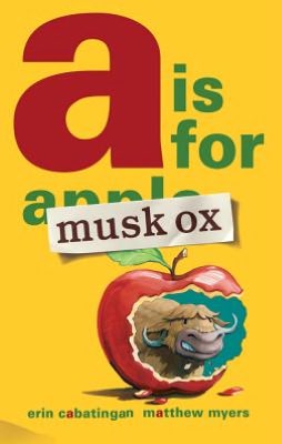
Textual presentations, storylines, coupled with the pictorial interpretations are as unique as the authors and illustrators themselves.  My fifty plus collection has recently grown by another title, A Is For Musk Ox ( A Neal Porter Book, Roaring Brook Press, October 16, 2012) by debut author, Erin Cabatingan with illustrations by Matthew Myers.  It would seem that Musk Ox wants to give this volume his own special twist.


Hey!
Hey you,
Musk Ox!
Did you do this?
Did you eat
that apple?

Pieces of apple, a discarded core, lying about his feet, apple juice dripping from his mouth, Musk Ox is confronted by a perturbed Zebra.  Finally admitting his guilt, he tells the disgruntled Zebra that on the contrary, the book is not ruined but saved.  In fact he has the perfect solution, "a" should be for musk ox.  

Of course, Zebra believes this suggestion to be ridiculous.  Musk ox does not start with "a".  In fact, there is no "a" anywhere in those two words.  Ever persistent, ever persuasive Musk Ox has the perfect answer, a musk ox is awesome, lives in the Arctic where some of the state of Alaska is located.

Zebra relents moving on to the letter "b".  Musk Ox wants that too, claiming musk oxen fur is brown and black.  Completely disgusted at this point, Zebra says he can have "b" and "c" as well.  For Musk Ox, that is like waving a red flag at a bull; it's full steam ahead.

When there is not an actual fact to fit a letter, Musk Ox continues to enumerate his many and wonderful attributes, at least in his opinion.  Lest you think, it's smooth sailing all the way to "z" for this hooved, horned herbivore, think again.  Letters "k", "l" and "m" result in some rather testy back and forth discussions between the two characters.

To be perfectly clear not every letter representation is replaced with musk ox.  He does have some alternatives which he justifies using his own personal brand of logic.  When Musk Ox finally arrives at "z", he and Zebra finally agree but to the delight of the former and the total humiliation of the latter.  Why is Zebra chasing Musk Ox?


Told entirely in conversations between Zebra and Musk Ox, with Musk Ox taking center stage for many of the letters, Erin Cabatingan gives her characters personality with a punch.  These two don't mince words (or thoughts) having discussions loaded with attitude.  It's a game of one-upmanship in the world of alphabet.  Here is a sample passage.

U is for musk ox
Because musk oxen 
have underwool!

You said that already.

Well, what do you want
me to say? Underwear?
Some parents might
not like that.


When looking at the front cover, the first thing you notice is the cutout, the bite out of the apple, framing Musk Ox with Zebra standing, hands on hips, looking at that strip of words glued over apple.  On the back cover is Zebra's own alliterative views glued over A Is For Musk Ox because...are annoying, and always about as aggravating....  Matthew Myers colorful visuals rendered in oils on illustration board are full of expressive spunk and your-stomach-will-hurt-from-laughing-so-much humor.

A variety of pale backgrounds showcase his characters and their faces as does the changes in perspective and zooming in for close-ups.  Depending on the letter and conversation his backgrounds might mirror the narrative; bookcases in a library, snowy Arctic abode of Musk Ox complete with a recliner and television set with rabbit ears.  The excluded word is shown somewhere in the overall illustration; clown shivering outside the window of Musk Ox's home, a shattered lamp, a tiny green turtle in the snow.  Myers chooses to use a single page, half page or even a double-page spread to focus on a letter adding to the flow, creating a sense of movement.


If you're looking for an upbeat, snappy alphabet book packed with hilarity, A Is For Musk Ox written by Erin Cabatingan with paintings by Matthew Myers is a sure bet.  Reading it aloud with a voice brimming with expression, will have listeners laughing like crazy.  I can also see this working well as a reader's theater title.

Here is a link to the publisher's website for more illustrations.  If you follow the link embedded in Matthew Myers' name you can see other visuals as well as informative pages revealing his illustrative process.  Here is a link to the ARKive for Muskox.

Friday, August 10, 2012

The Fabulous Twenty-Six...Picture Book August 10 for 10... #pb10for10


This will be my first time participating in what is now the third annual August 10 for 10 hosted by Mandy Robek of Enjoy and Embrace Learning and Cathy Mere of Reflect & Refine:  Building a Learning CommunityThis is a time for people who love picture books to come together highlighting those books used in a classroom setting previously, those they intend to use this coming year, those with a common theme or those they would have to have with them in case they are stranded on a desert island.  Because my personal collection is extensive and after spending thirty-four years as a school librarian, picking only ten seemed impossible.  But as I tell my students start small and build up. 

I love alphabet books and have been collecting them for quite some time.  My list includes ten (plus one)(shoulder shrug) some of which I have used in the classroom for lessons, some because their approach to the alphabet is innovative or clever and all for their illustrations.  I have listed them in order by publication date.


1.  A My Name is Alice (Dial Books for Young Readers, 1984) by Jane Bayer, pictures by Steven Kellogg
Students have loved this book for years and years.  The rhyming and rhythm are contagious.  It invites prediction on every turn of page.  As a follow up activity students work in pairs thinking of a letter, names for the wife and husband beginning with the same letter, a place to live using the chosen letter, what they might sell and an animal for each beginning with the letter.  They can then pick the place where they live or either of the animals to do further research.


2.  Alphabatics (Simon & Schuster Books for Young Readers, 1986) written and illustrated by Suse Macdonld (Caldecott Honor Book, 1987)
Creativity abounds in this book where gradually a letter changes into a word beginning with the same letter.  Students love to figure out what the letter becomes as well as think up their own. 


3.  Animalia (Harry N.Abrams, Inc., 1986) written and illustrated by Graeme Base
 I will never forget the first time I saw this book.  I spent days looking at the illustrations searching for as many words beginning with each letter of the alphabet not to mention trying to find a small portion of the stripe-shirted boy hidden in each detailed picture (which Base states took more than three years to complete).  This is a wonderful volume to use when teaching alliteration, or extending vocabulary. I believe there are still posters available for each of the letters.  My favorite is, of course, Lazy Lions Lounging in the Local Library.


4.  Tomorrow's Alphabet (Greenwillow Books, 1996) by George Shannon with pictures by Donald Crew 

A is for seed---
tomorrow's APPLE
B is for eggs----
tomorrow's BIRDS
U is for stranger---
tomorrow's US

This is another of those books that invites readers to think outside the box; many times asking them to predict a less than tangible answer.  After a read through a class alphabet book is generated.  Every year I am impressed by the thoughtful pages designed by the students.


5.  Quilt Alphabet (Holiday House, 2001) by Lesa Cline-Ransome, illustrated by James E. Ransome
This is a collection of poems for each letter of the alphabet.  The poems are riddles which describe something which might be found in a country setting.  My favorite is for the letter "N":

As the sun lies down
for an evening nap
And the day begins to fade
The moon and stars come out
to play
And the sky pulls
down the shade

The poems might be difficult for younger children; varying each year with a particular grade level.  This volume could be used for a study of country life, historical fiction, a themed unit on quilts, poetry or an alphabet study.  I use it with younger students having them create a quilt block (graphically) with a letter in the center.  In one corner goes the letter before the center letter and in the opposite corner the letter which follows.  In the alternate corners are pictures of items beginning with the center letter.


6.  Alphabet Under Construction (Henry Holt and Company, 2002) written and illustrated by Denise Fleming
This is used in conjunction with an author study of Denise Fleming, as a Caldecott Award winning author.  The same mouse appears in another of her titles, Lunch which acquaints readers with colors, fruits and vegetables.


7.  The Hidden Alphabet (Roaring Brook Press, 2003) written and illustrated by Laura Vaccaro Seeger
This book is an example of sheer beauty.  The students love the lift and look idea. 


8.  Alphabeasties and other Amazing Types (Blue Apple Books, 2009) by Sharon Werner and Sarah Forss

I cannot even begin to imagine the time it took to compile the art for this book.  Every time I look through it, I find something I have never seen before.  Each animal representing a letter of the alphabet is created with a compilation of those letters. Surrounding the animal are visuals of other words beginning with the same letter.  There are flaps to flip and folds to open.  Created on heavy paper it is bookmanship at its best.  (Is bookmanship a word?) If you do an image search in Google or Bing you can see other images found in the book.


9.  L M N O Peas (Beach Lane Books, 2010) written and illustrated by Keith Baker
We are peas---alphabet peas!
We work and play in the ABCs.
I never would have thought to have peas act out occupations but this book is a boatload of fun.  Try it with a unit on possible careers or things people do outside of their daily work.


10.  Apple Pie ABC (Disney/Hyperion Books, 2011) written and illustrated by Alison Murray
This delectable volume follows a dog and his human during a pie baking adventure.  I reviewed this here.  I really like the idea of taking the letters of the alphabet to create short phrases when combined are a story.


10A.  Z is for Moose written by Kelly Bingham, pictures by Paul O. Zelinsky
I could not make a list without including this book.  Certainly it is one of the best alphabet books of 2012.  My full review is here.


Okay, I am sorry but I was about to close this post out when I remembered another that must, must be included.
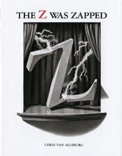
The Z Was Zapped written and illustrated by Chris Van Allsburg.  Each year all the grades complete an author study of this phenomenal illustrator.

I will try to follow the rules better next year.


Tuesday, March 6, 2012

It All Begins With...ABC

After recommendations by two tech people whose opinions I respect, Richard Byrne of Free Technology for Teachers and our own head tech, Scott Mays, at Charlevoix Public Schools, I decided it was time to move this up to the top of my "to explore" list and make a visit to Alphabetimals.  This site which is free to use was designed by freelance cartoon illustrator Patrick O'Toole and his wife, a psychologist, to promote literacy.  For students, teachers and parents this is loaded with activities and resources.

When visiting the site the first activity, front and center, is a book where each of the letters in the alphabet are introduced.  As the pages turn the sound icon at the top produces the sound of the "letter animal" as the letters to the left move.  On the bottom that icon is a pronunciation of the animal's name.  Of course, not being able to resist I clicked on every single letter.

Beneath this activity users are invited to type in an entire word in a box.  I typed in the word "BOOK".  I expected with the double "O" to have the same "letter animal" used twice but a different animal was shown for the second "O".  Users then have the option to preview it on fun gifts, share it on Facebook, Twitter or via email or print it out. 

Free cut-out flash cards, coloring pages and a wall poster are available by going to their Facebook page.  I did go to their page and Like them.  To get the PDFs of the cards, coloring pages and poster the next screen states:  Secure browsing is not supported (https).  I decided not to proceed as I wish to protect the information contained in my Facebook profile.  Hopefully these will be available to download securely on site soon.  The Facebook page did state that they hope to have a coloring book for sale soon as well as an app for a mobile device. 

I can see using this application for activities beyond the initial introduction to the ABCs and the pronunciation of the words.  Some of the animals might not be familiar to the students so basic research would be the next step.  Links to such sites including the animals, National Geographic Kids, Kids Biology.Com, or Kids' Planet ESPECIES Animals Facts Sheets,  could be placed in the same folder as the link to Alphabetimals.  Older students could assist with the reading of information.

I recommend using this site not only for the obvious reasons but for its potential for exploration.

Monday, December 12, 2011

A New Take on the Alphabet

For nearly thirty years I have been collecting alphabet books.  I was particularly thrilled to see two new original titles talked about in A Bit of Abecedarianship Before Breakfast:  "Operation Alphabet" and Paul Thurlby,  a post at Seven Impossible Things Before Breakfast by blogger, Julie Danielson in October.  I recently acquired my own personal copy of Paul Thurlby's Alphabet by Paul Thurlby.


To begin I, much like Ian Falconer's Olivia, love the color red.  It seems to shout out loud, "Hey everyone, here I am.  Let's have some fun!"  All but seven of the letter illustrations have shades of red in the smallest detail or as large as a background or defining character.

The book jacket on this title unfolds to become a poster illuminating smaller versions of all the letters gathered in one spot for your viewing pleasure.  The front and back endpapers are a tiled repetitious mosaic of "A", "B" and "C".  The title page and Artist's note at the end are rendered on an aged-looking graph paper design replete with alphabetic doodles; possibly notes made by Thurlby as part of his design process.

While the format of this book is simple, an upper and lower case letter centered on the left page with " " for on the right side, the result is astoundingly clever.  Each letter graphically defines the featured word; "A" for Awesome!, "B" for Bounce, "C" for Catch...  Use of varied font styles for each word will delight appreciative readers as will his skill at adding those extra little touches.  In "Z" for Zip the Z is being unzipped but the "i" in zip is a zipper also. 

Another interesting note is Thurlby choice of words representing each of the letters.  While some are typical, "D" for Dog, "M" for Mountain others are more quirky, unusual, "E" for Embrace, "Q" for Quicksand.  He shows no partiality to parts of speech either; words are nouns, verbs, adjectives. 

Paul Thurlby's venture into the world of children's books began, as he states in his Artist's Note, as the result of a Christmas present, a book titled ABC3D, a paper sculpturing marvel by Marion Bataille. (Without shame I admit that I, too, own a copy of this book.) As he completed each letter he would post them online to bloggers' delight.  Great graphic design does not go without comment.  A literary agent noticed his letters and a book was born.

Thurlby further states in his note:  I use old books, postcards, and pieces of paper for the backgrounds.  I will often buy an old book just to use its back cover!  In gathering these pieces of time each illustration, digitally created, gives the readers the impression of gazing at vintage artwork fused with present playfulness.  Repeated readings will reveal new details or offer for discussion the possibility of what might be included.

Paul Thurlby's Alphabet is a refreshing perspective on those twenty-six letters which have given us so many amazing literary wonders.  Employing his expert workmanship in graphic design Paul Thurlby presents illustrations, each of which is, worthy of framing.  Lucky for us his web site linked above provides readers with the ability to purchase his book, prints and cards of his alphabet, a set of numbers and other delightful examples of his creativeness.

Wednesday, November 9, 2011

The Alphabet Never Tasted So Good

Recently browsing through one of my favorite local bookstores, a book resting on the shelves beckoned to me.  Scottish author/illustrator, Alison Murray, has fashioned an alphabet book, Apple Pie ABC (Hyperion, May 31, 2011), that is good enough to eat.  Her take on the classic nursery rhyme is fresh, vibrant, unique and just plain delectable.


Georgie, a lovable mutt, is on a quest for the apparently unattainable.  His forever friend, Grace, has made an apple pie.  Nothing will deter her canine companion from acquiring that apple pie.

Every letter of the alphabet follows Georgie in his persistent efforts.  A apple pie, B bake it, C cool it, ...N not giving up, O ogle it, P pine for it, ...U underneath it, V very nearly, and W whoops!  Despite Grace's attempts to protect her perfect pastry Georgie's goal is met.  Love for Georgie shines through in Grace's final peek at her best buddy.

It was color that first brought my eye to Apple Pie ABC.  Rich reds radiate throughout the book beginning and continuing with vibrant text. Large blocks of red surround each creamy alphabet letter or they are shown entirely in red. 

Murray's endpapers are a collage of squares highlighting A, B, and C with Grace and Georgie silhouetted in opposite corners as ingredients and cooking utensils fill the others.  The title and publication information is laid out across double pages picturing Grace at a table reading a recipe book with Georgie smiling looking up.  Letters A, I and Z are illustrated using two pages while the remaining letters may have a single page or share space with letters; pleasing in its effect but also creating tension as Georgie nears his objective.

Use of orange, blue, golden yellow, spots of pale green and black coupled with the illustrative design bring a warm nostalgic feel to the title. Apple pie is definitely comfort food.  Murray's interpretation of two friends sharing while the one is the creator and the other the consumer is lovable in every aspect; word choices are the kind that roll around on your tongue in joyful anticipation.

In an email request as to her techniques employed in illustrating this book she generously responded as follows:

I mainly work on computer.  First I draw the characters and some of the background objects in Adobe Illustrator.  Then by hand, I create different textures using pastels, paint strokes and various print techniques.  I scan these into my computer and then combine the two in Photoshop.  I think the blotches and happy accidents that you can make by hand humanise the line work drawn on computer.  I built up the image in layers a bit like the process of screen printing but on the computer. You can keep changing the colours till you (are) completely happy with the final illustration.

I see that another book, One Two That's My Shoe, featuring at least Georgie, will be released in 2012; lucky readers one and all.  Sharing Apple Pie ABC with others as a group or one on one is something to be relished repeatedly.  I can visualize a group acting out Georgie's antics as we weave our way through the alphabet toward a taste of that perfect pie. 

Alison Murry has a picturesque web site devoted to Apple Pie ABC.   Please see it by clicking on the link at the top.  Offering interesting information and fun activities it is a plus for viewers.