 Themeefy is a web 2.0 application that allows you to curate the social web and personal experiences, customize and publish learning. This service is free. The Terms of Service and Privacy Policy cover use by persons under the age of 13. An informative section of the Privacy Policy, Children's Personal Information, states that districts using Themeefy need to make sure parental/guardian approval has been obtained. The developers of this web 2.0 application intend for it to be utilized in an educational setting.
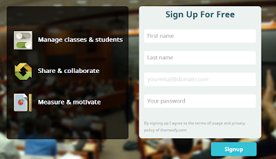
With a few clicks on the keyboard I had a theme name typed in and selected the Create Theme button. At this point I have not signed up yet. The next screen, the workbench, provides a short text box type tour of many of the icons by clicking the forward and backward arrows. This is very helpful for a new user.
As soon as you arrive at the workbench the left side of the screen is filled with hits from a Google search of the theme name. Beneath each item is the source link which gives you a chance to check for accuracy, relevance and authenticity. You can type in new keywords in the search box to look for images in Flickr (moving from left to right with the icons), search for and add a URL link, upload files from your computer, upload images from the web or upload a file using a URL link, you can search for tweets on Twitter, create notes and search for videos on YouTube. Each item can be previewed by clicking on the eye icon (taking you right to the website by opening up a window within the workbench) or added to your magazine by clicking on the plus sign. (1)
Your work in progress, magazine, appears on the right. The title of your Themeefy can be altered with the click of a mouse. By clicking on the pencil icon to the left of your title box, you are taken to the upload options. (2)
After you click the plus sign for an item on the left, a copy shifts to the right with icons on the right for uploading, previewing and deleting. Each time an item is added to your magazine the default image for Themeefy is shown. When you upload an image, it replaces it. You can also mouse over any text which originated with the item, change or add to it.
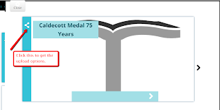 At any time during the adding of items to your magazine you can click the preview button above your column on the right. The first page is your title. You can move forward and backward by using the arrows. As noted the icon on the left opens up the upload choices.
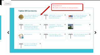 The next page is your table of contents. By clicking and dragging you can rearrange their order. If you click on the title of the item it will take you to it immediately (except for some reason this would not work for the listed tweet pages). Videos can be viewed within a page.
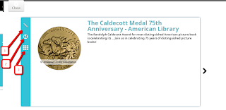
The page for each item in your magazine has three icons on the left. The top is for opening the three upload selections (1). The middle icon takes you directly to the media listed (2). If you want to head back to the table of contents, click the bottom icon (3)
For me getting images of maps in Bing worked better than Google maps. They would open very well on the left in preview mode. But they would not shift over to the right side correctly.
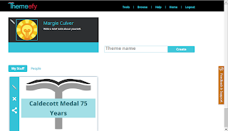 In order to share your work you need to sign up. To register you need to provide your first and last name, email address and a password plus agree to the Terms of Service and Privacy Policy. A new window opens to your profile page when this is completed.
Click on the bottom icon on the left side of your created magazine. This will publish your work. You can share via a URL, on Facebook or Twitter, add a password so only certain people can view your work or unpublish the magazine. Here is the link to my created magazine, Caldecott Medal 75 Years.
If you get stuck during this process the FAQ section will help. I did send an email with a question and I received a reply within minutes. I inquired about having an HTML embed code for blogs and websites. It is coming very soon.
The huge advantage of Themeefy is the educator piece, especially for students under the age of 13. To be able to have a free account, adding students from classes, monitoring their work in a secure environment, is great. The ability for students to collaborate on magazines is an excellent feature.
It really couldn't easier to use. I was able to navigate between each of the ways to add items with absolutely no problems. If you make a mistake there is always a window of opportunity to make corrections.
Themeefy is a must add to your virtual toolbox.


Thank you for the very clear instructions and benefits of using Themeefy.
ReplyDeleteYou are very welcome. I'm always glad when I can help. Thank you for taking the time to comment.
Delete